Label and Poster Design for ABLE Brewing
Summer Campaign for "Not Quite Forever"a new Raspberry Lime Sour
Tools: Adobe Illustrator
Reading about Able Brew’s raspberry lime sour named “Not Quite Forever”, I immediately laughed because I found the name to be a bit cheeky. Two themes immediately popped into my head. First, a tortoise. They live so long but not quite forever. Tortoises also have interesting colors and patterns that would look striking as a graphic icon and they are adorable.
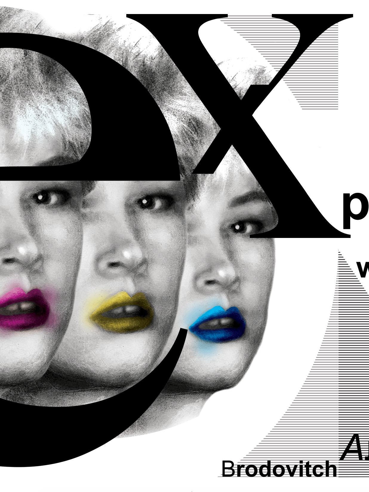
The second thing that came into my head was nostalgia, particularly nostalgia for and romanticism of decades passed when advertising and media would define the youth culture of the day by “moments that could last forever”, moments of hanging out, having fun and bonding with friends and lovers punctuated by a particular brand of soda or beer in tow. Coupled with nostalgia, the raspberry lime sour “Not Quit Forever” color palette of lime greens, pinks, magentas and purples sent me back to the 80s and 90s. I think of summer and heat, sweating, sunglasses, thirst, fresh fruit, dew, sexy, cool. I think of an iconic and idealized, graphically striking and simplified beautiful young woman a la Patrick Nagel with sensual emphasis on the mouth, full of taste buds and thirst. I currently have developed the second idea more than the first.
Mood board, Color Palette and Typography
Label design iterations
The Final Label
The final can mock-up
The Final Poster
The Instagram Ad

