LOGO RE-DESIGN FOR FISHERY POINTE, LAKESIDE RESORT
Tools: Adobe Illustrator and Adobe Photoshop
I was hired to redesign the logo for Fishery Pointe, a lakeside resort in the upper peninsula of Michigan. The protective buyer of the resort hired me however the sale fell through.
The owner made a preliminary sketch of what she wanted. She sent me her photos of trees on the property that she wanted included in the logo. Her over all feel for the logo was to evoke advertisements and signage depicting Americana road trips and camping around the Great Lakes in the 1950s.
We agreed that a selling point is the fact that at night, the moon and all the stars that are visible and are gorgeous. That is why we went with a lake and forest at night theme.
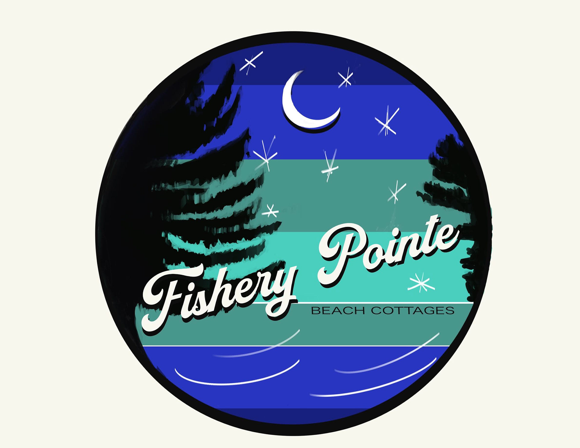
This is the initial digital sketch the prospective owner sent me:
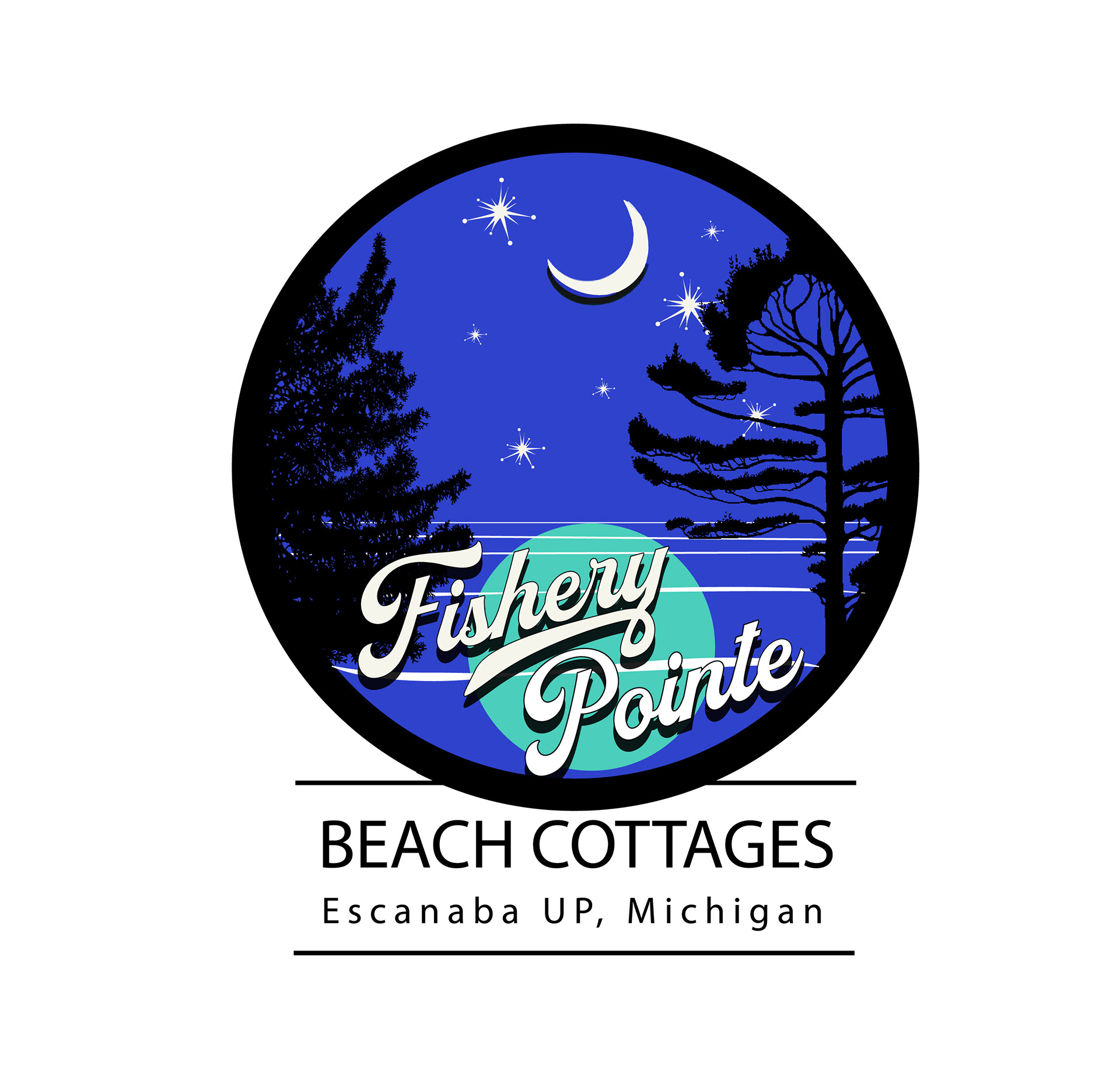
This is the final logo:
The owner wanted the same general colors and wanted the same font for the name. I started with these brainstorming designs.
I began with these iterations....
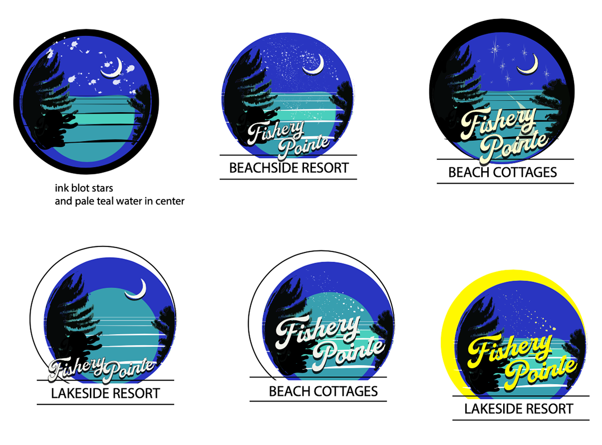
She chose one logo with details from different beginning iterations. She also stated she wanted 1950s style stars. I made these second iterations.

Some 1950s style stars I made with Illustrator

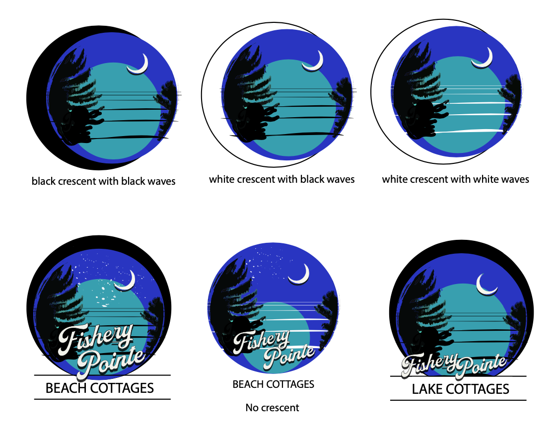
After iteration group #2, she wanted a lightly different style of 1950s stars, an even black border and teal circle in the water. She also wanted the the tail of the "y" to be wavy like the water. The trees were just digital mockups and stand-ins for the final tree forms.
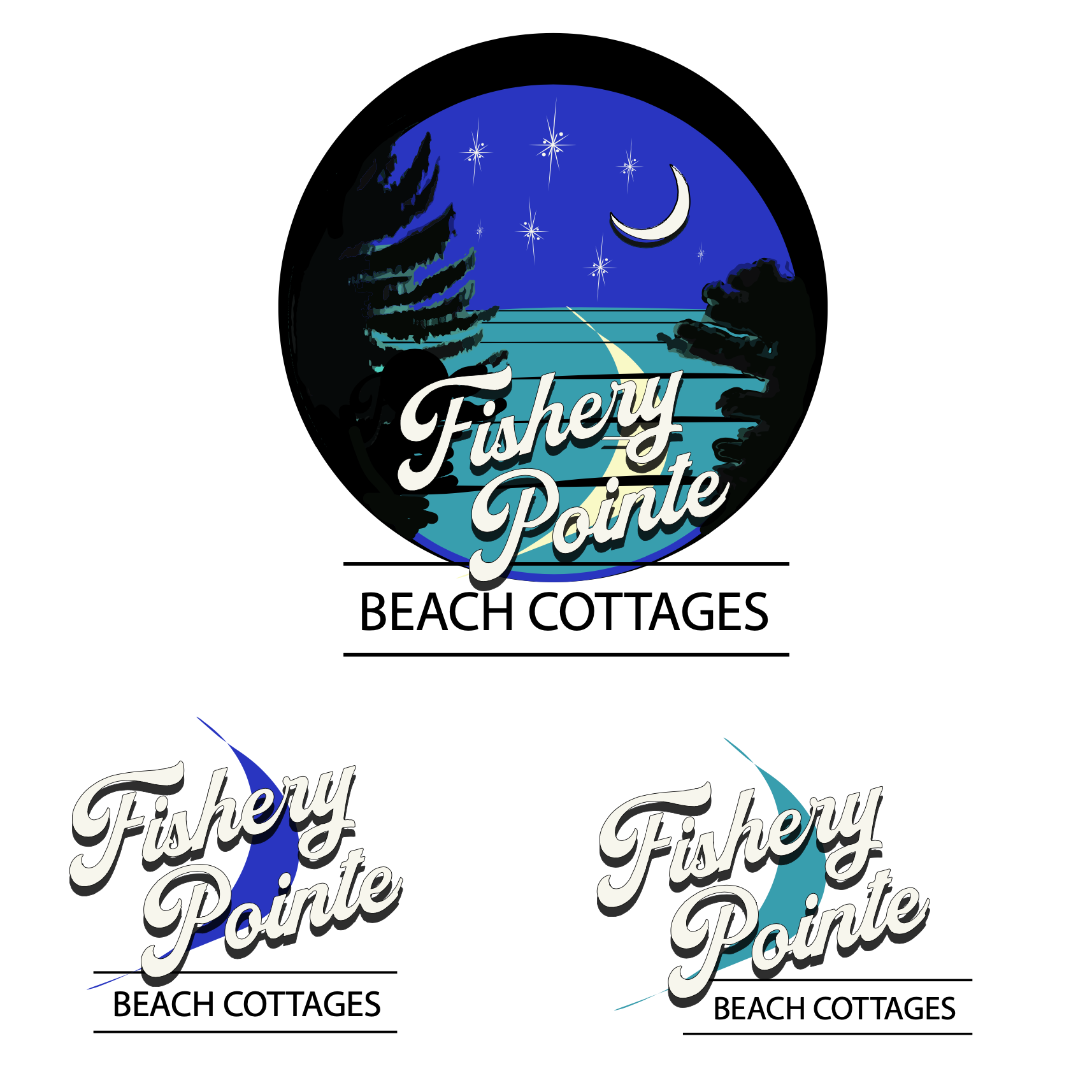
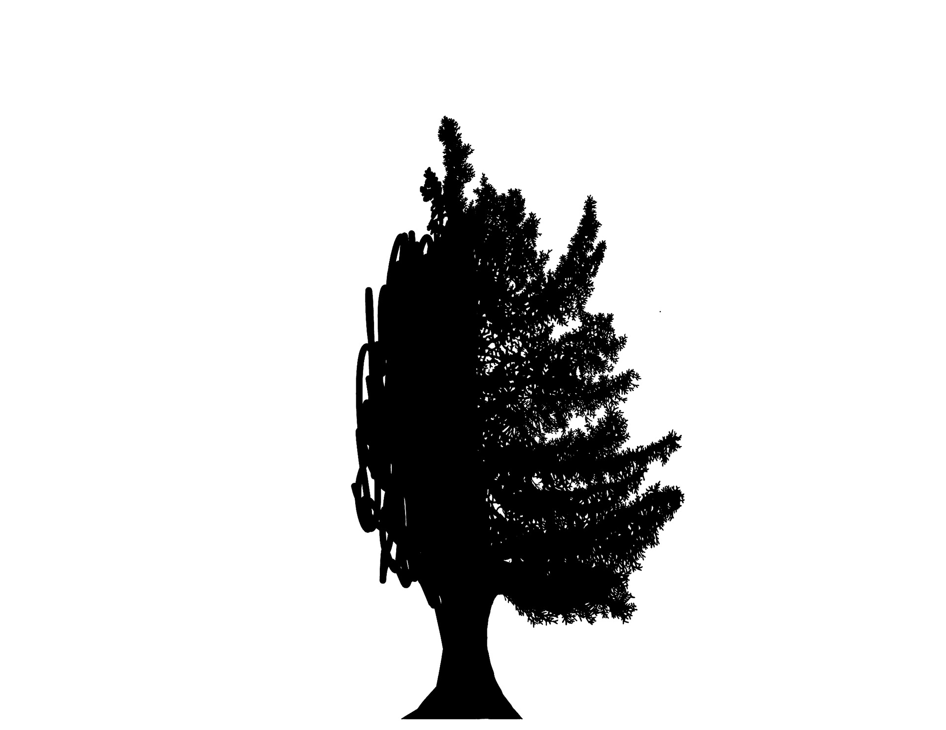
She sent me the tree assets to add to the logo. She also sent me a sign and asked that the tail of the "y" in "Fishery Pointe" be like the tail of the "n" in this sign.


Here is the the tail of the "y" fixed and the number of stars decided on. This logo was approved to be the final one. I only had to add a little more info about the place...
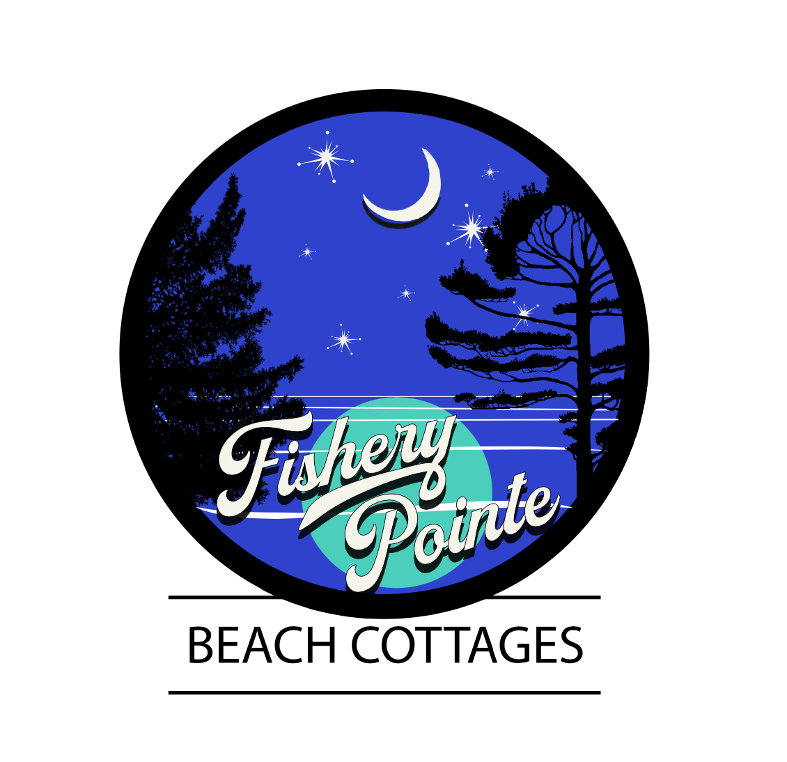
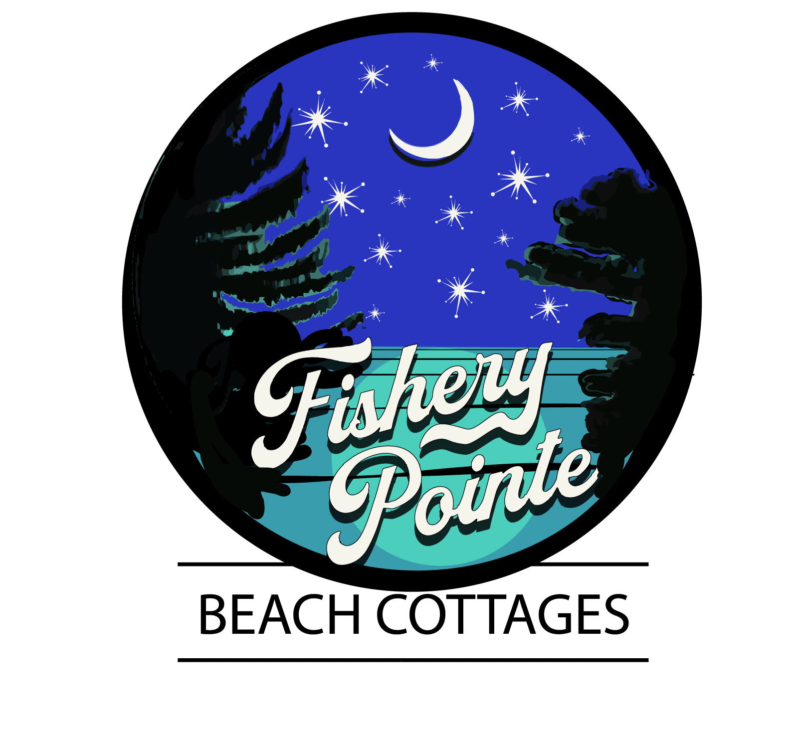
The finished final logo.